Some Very Small UI Tweaks I'd Love to See in Mona

— 2 min read
Mona is currently in beta, it's launching officially in May, and in most ways I think it's the best Mastodon app for me. I love the customization it offers, and its sync features are extremely quick and reliable.
But I still find myself using Ivory sometimes because while Ivory lacks some of the features and customization of Mona, it makes up for it in refinement. Everything just feels great in Ivory.
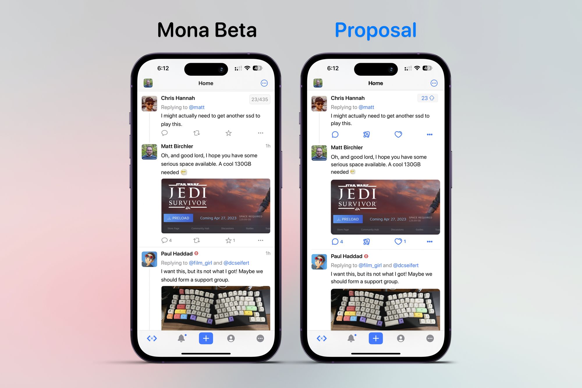
The above screenshot is a quick mock up of some changes I'd like to see that can't be changed today with themes or Mona's many other settings.
- Update the icon set to something more fun. The current icons are pretty utilitarian, and while they may work for some, I don't love them. My proposed icons are from Streamline, and yes, they are similar to what Ivory uses.
- I've also increased the icon size a bit and added a few pixels more vertical margin to spearate them a bit from the other content. I find the current layout to be a bit cramped.
- For images, I've increased the border radius a few pixels as well as added a very subtle drop shadow underneath them. I think the effect is subtle, but effective.
- I'm not convinced I've nailed it, but the pill in the top right that shows how many posts are left isn't quite right for me. The "23/435" indicator is needlessly wordy (numbery?) as I always care about the 23, but never the 435. I would suggest just leaving the number showing how far from the top I am, and maybe include an arrow pointing up if people aren't quite clear what that is indicating (although I think most people would get it pretty quickly). UPDATE: Some nice folks on Mastodon let me know you can remove the "/435" by going to Settings > General > Display > Number of Posts. I thought this would remove the whole indicator, not just half of it, so good to see this is an option, although the wording of that toggle could use a tweak for clarity.
- Most trivial of everything, I would make the horizontal dividing line between posts less than 100% width and instead align it with the width of the post content. This really doesn't matter, but I think it looks cleaner this way and is just as effective at communicating the separation of posts.
Anyway, these are some minor tweaks I wanted to make as a fun little exercise for myself. I spend all day stressing about UI choices in software used by millions of people, so these low stakes experiments with other people's apps is a good way for me to do what I love, but with far lower stakes.