Safari 15: What You Gain, and at What Cost?

— 5 min read
Disclaimer: This is pre-release software and it is subject to change. This is not meant as a criticism of the consumer version of Safari, nor is it an attack on the designers or developers working on this project at Apple, it's just a few observations I have that I hope can in some small way help articulate the usability concerns some are experiencing so they can be addressed before the final launch.
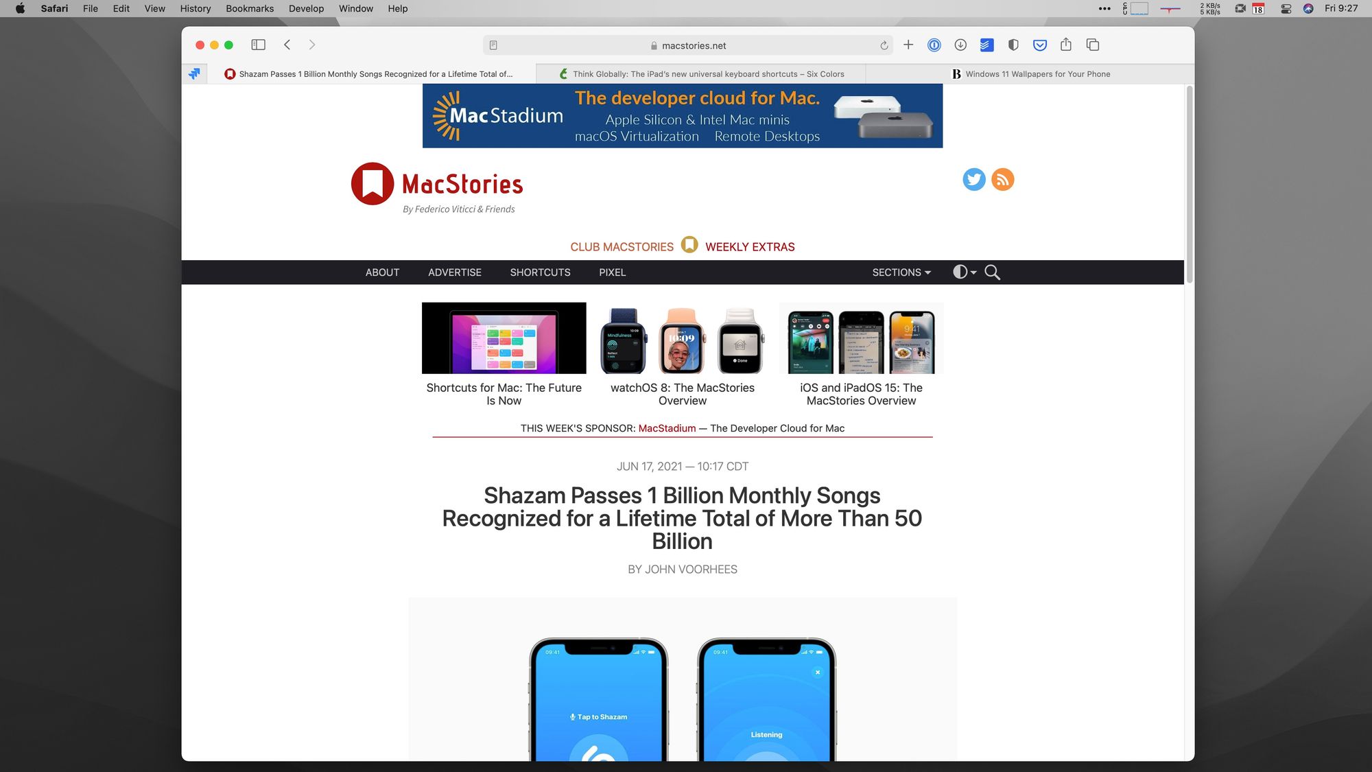
The image at the top of this page shows what the current version of Safari looks like when running on a 1080p display. I've got 3 tabs open, plus a pinned tab that I always have open. I'm not someone who usually has more than a few tabs open, and this is a pretty realistic state for me to be in.
Safari 15, coming this fall, has a few changes, including tab groups and a "streamlined tab bar." The tab groups that sync between your devices are really cool and I love them, but the tabs are…more controversial. Here's how Apple describes them:
The new tab bar design takes up less space on the page and takes on the color of the site you’re on, extending the web page to the edge of the window. Redesigned, floating tabs have been combined with the Smart Search field, with buttons streamlined into the More menu, giving you access to powerful Safari features with the click of a tab.
To summarize, Apple says the benefits are:
- Less vertical space taken up by UI
- The browser window can take on the color of the website you're on
- The "more" menu holds powerful tools "with the click of a tab"
Let's take a look at these in order.
1. Less Space Taken up by the UI
This one is pretty easy to test, so I opened the same tabs in Safari 14 and 15 to see the difference.
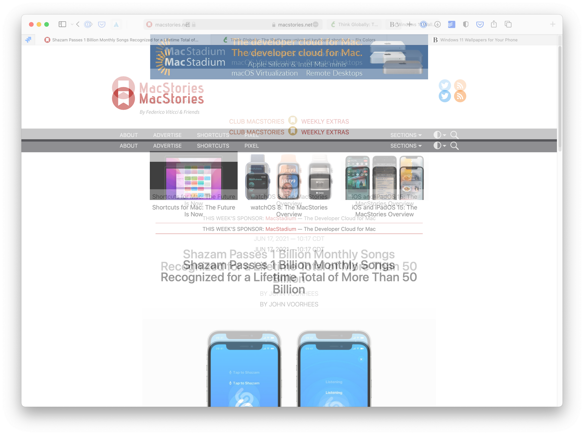
And sure enough, there is some vertical space reclaimed in the new UI! By my measure, the top chrome in Safari 14 is 80 points tall, and in Safari 15 it's 52 points. That's a 35% reduction in height, which is substantial, although it ultimately works out to 28 raw points on the screen, or 1-3 lines of text depending on the page. That's certainly not nothing, but it's also not going to be game-changing in most cases.
But however big of a deal it is, this does ultimately save a little space.
2. Tabs Take on the Color of the Website
If you're using the new Safari already, you may have noticed this site adds a blue tint to Safari.
This is because I use the following line of code in my site's header.
<meta name="theme-color" content="#70959D">
I've used this for a couple years since browsers like Vivaldi have had a similar feature (shown below).
Whether you like this or not is a personal thing, but I kind of dig it. I just wish icons wouldn't turn blue because they tend to disappear into lots of accent colors.
3. The More Menu
Apple advertises the "more" menu has having powerful functions just a click away, and here's what's under it:
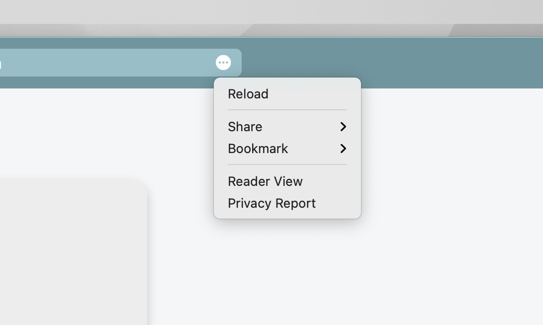
I would argue those are pretty basic features, and all of them were available with a single click in the previous version of Safari. Maybe this cleans up the UI from distractions, but in terms of making functions accessible, this doubles the clicks (and negatively impacts discoverability) to do all of these things.
It's also worth noting that if these buttons truly annoyed you before, you could always hide them to get them out of your face. Sadly, Safari 15 in its current beta form does not allow you to pull these things out of the "more" menu and make them always accessible.
At What Cost?
Design is all about compromise, and anyone who says otherwise should talk to more users. So what are the costs of these changes?
Tabs Take Up More Space to Show Less Info
I think the biggest cost for me in my usage is that tabs seem to take up more space than before, but somehow also seem like they give me less information.
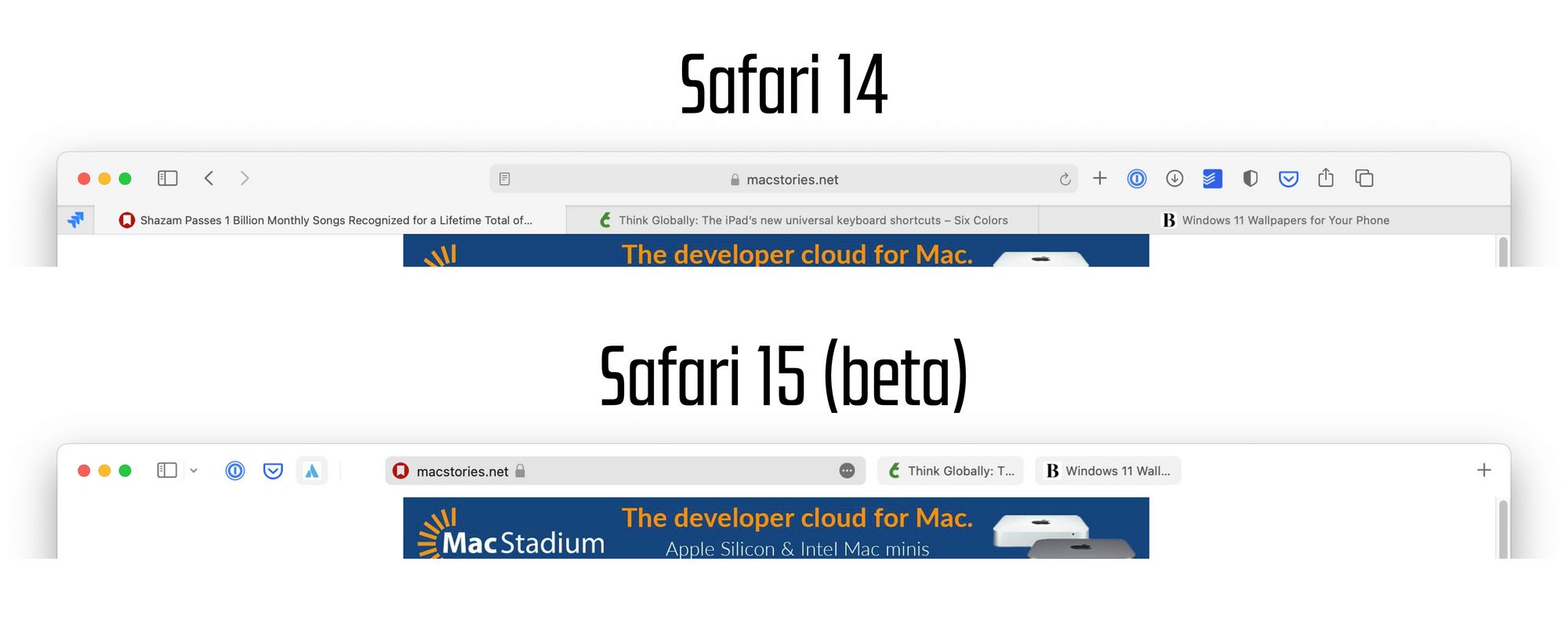
In Safari 14 I can clearly see the names of the 3 tabs I have open, as well as the domain for the site that I'm currently looking at. In Safari 15 beta I can't scan my tabs to find the right tab quickly. Especially if I have a few tabs from the same domain (very common in workplace situations) then they all may as well be the same thing since I can't see more than the first few characters. I can hover over each one to see the full title, but that's time consuming.
And this comes with no new information for me. The current tab takes up way more space, but has removed information that might be helpful, all without adding anything new.
Useful Items are Hidden and Move Around
My Safari 14 toolbar is a little cluttered, but having things like downloads, sharing options, and a relaod button always accessible were convenient (as of writing this, I already removed the privacy report and tab overview buttons since I never use them). But moving all of these controls under a menu means I have a harder time accessing them. Yes, keyboard shortcuts exist for most of these, but if you don't use those shortcuts, then this will be more inconvenient.
What makes this more inconvenient is that since the "more" button is attached to each tab, it means these controls are constantly moving around the interface, so it's hard to develop muscle memory for accessing them.
I find this bit especially surprising because Apple and Apple fans traditionally have been big proponents of predictable UIs and they'll typically roast other companies who don't follow this core UI concept, but Safari 15 appears to be a rejection of that concept in many ways. Maybe this is the future, but I'm not convinced.
What to Do?
I'm sure Apple has gotten lots of feedback already, and I expect they'll get even more once the public beta is available next month. I don't think browsers need to remain the same forever, nor am I averse to change (I love it, in fact), and I think there is some good stuff going on in this update to Safari.
In terms of changes, I think Apple can help address my primary concerns by allowing me to add the hidden controls to the app's toolbar. Seriously, just letting me add the reload and share buttons would go a long way!
I very much hope that the Safari team makes a few nips and tucks to the UI to make the app a little nicer. I enjoy change and the designers working on Safari are more talented than me, but I think this update needs a bit more love before this fall's final release.