Fundamental UI Problems with Android TV

— 1 min read

Android TV is here and tech sites are putting up their impressions of Google's latest foray into the TV space. While it does look like a better platform than Google TV ever was, and is more ambitious than Chromecast (which does one thing and is great at it), I can already see some jankiness in the design.
In the above screenshot, you can see that you have the ability to force quit an app. You know, something you definitely want to do on your TV. "All the joy of misbehaving apps, now on your TV!"
How about all of this madness in the Settings app?
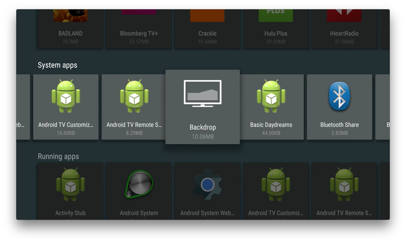
This just looks like madness. Giving the user a window into these processes is crazy for a modern user interface. It's even worse when that UI is for a TV, the ultimate "lean back" experience.
I say all this coming from using an Android phone for the past few months. The first level or two of UI are nice, but it doesn't take much effort to get away from the pretty face on Android and into the weeds of incomprehensible names and places. I was shocked these existed on the phone, and I'm even more shocked they are still there on the TV.