Android Pie Review: All the Little Things
This was originally going to be a longer review with more than 2 short parts, but as I looked at what else had changed in Pie compared to Oreo, I found myself at a loss for how much could be said about each change. There’s a fair number of things happening behind the scenes, but from a user’s perspective, the changes amount to a bunch of smaller things.
So instead of going into a great detail about everything, here are some notable changes and how I found them to impact my usage of Android.
Screenshot editing
This is a big one for me, as I take a lot of screenshots when I’m using my phone. I have used Annotable for years on iOS, although my use has dropped a bit since Apple added their own system screenshot editor in iOS 11. All markup apps on Android suck, so it’s nice to see Google take this into their own hands and adopt basically the same thing that Apple does with iOS.
Now, when you take a screenshot, you see a notification with the image, and you can tap “edit” to edit the screen before it’s saved/shared. The tools are the same as you’d expect, with crops, lines, and shapes, and gets the job done for me.
Not a thrilling change, but a nice addition to Android that I appreciated.
Volume controls
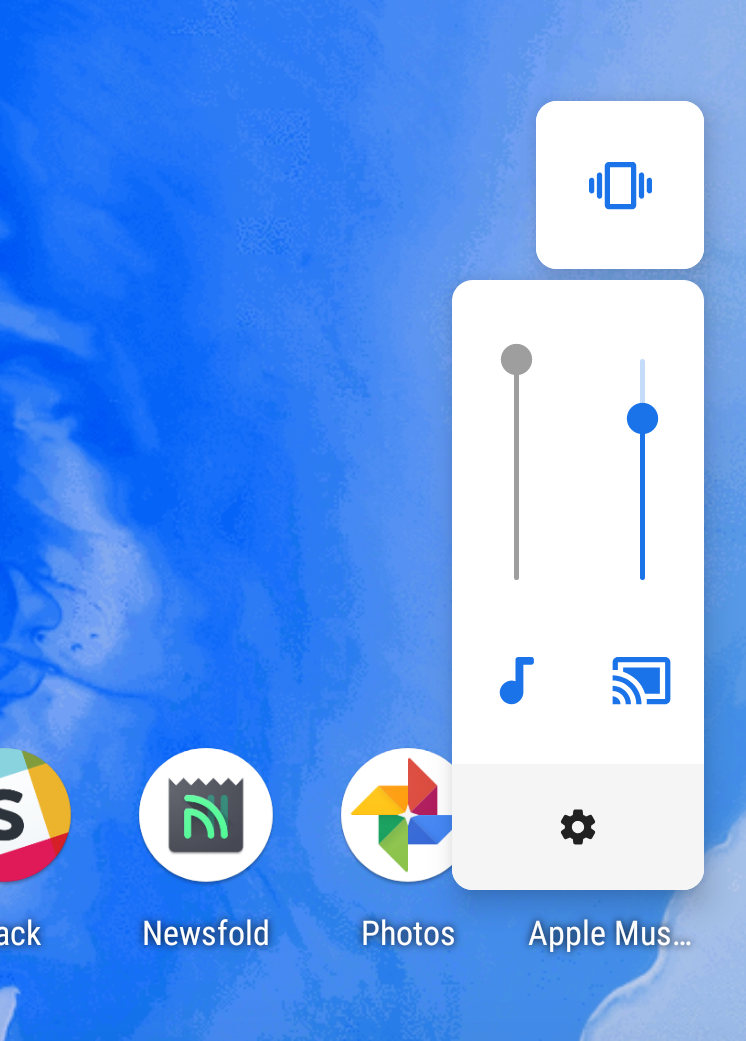
Another small, but welcome change is that the volume keys now only control media volume. When you change the media volume, the ringer status comes on screen as well, showing whether you’re on silent, vibrate, or ring. You can tap to toggle between those 2 states, but you need to go into the Settings app to change the ring volume.
This seems like the right way to do things, which is what this has been be behavior on my iOS devices for years 😉
You also see any Chromecast devices at the same time, and can quickly change their volume independent from your phone. It’s easy, intuitive, and delightful.
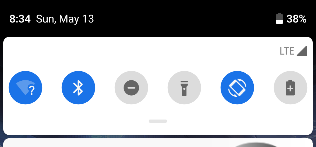
Notifications show fewer icons for notch room
This is another very minor one, but in order to make room for notched phones, Google has reduced the number of icons that will appear at the top of the screen, to only 4. Previously, this would show you all your apps with notifications, and could fill up basically as much space as you had up there.
Google’s decision to reduce this number makes sense for notched phones, but why is it also like this for phones without a notch? If the explanation is to clean up the top bar, I think it’s a supreme half measure. It’s still messy up there, but a little less messy and a lot less useful, since you only see the last few apps to notify you of something.
This isn’t the end of the world, but it seems like the most half of half measures they could have done here.
Small design changes
Android Pie is brighter than any Android version that came before, and I think it looks very nice. I recently sold my Pixel 2 (hence the lack of tons of screenshots in this article) and had to downgrade it back to Android Oreo before shipping it off. Oreo looks downright bland in comparison.
Many icons are more bold and curved than before, and there is more white and blue contrast instead of a general grey and dark gray that previous versions of Android had going on.
The animations are also really nice this year, with some really nice looking animations for everything from opening apps to bringing up the multitasking page.
https://www.youtube.com/watch?v=CzjzNW9kHp8
Rotation lock
This is a small one, but worth mention. When you have rotation lock on, your phone will not rotate when you turn it (duh, I guess), but a small icon will appear next to the home button that lets you rotate the phone this one time. Tapping it will make the screen rotate appropriately and then lock the phone into that rotation until you tap that rotation button again.
It’s a small thing, but it’s nice to have when you want to keep you phone in portrait mode, but also want to have it change for YouTube videos.
App Actions
These are very similar to Siri Shortcuts coming in iOS 12, with the idea being when you go to your app drawer, you see your apps, 5 apps that Android thinks you might want to use, and 2 actions inside your apps that might be useful at the time.
Despite using this for the whole summer, I never found myself using this feature because the suggestions were never on point for what I actually wanted to do at the time. I did get suggested navigation in Google Maps when I was going home, which was nice, but most of the time it was “launch Assistant” or “open a playlist in Pocket Casts” or “open Slack to this channel.”
I like the idea of this feature, and I’m impressed with what a more robust version of this allows in iOS 12, but so far it’s not doing much for me. Hopefully more apps will start working better with it and it’ll become more useful.
Adaptive brightness and battery
This is the poster child for “things Apple and Google do the same, but only Google gets credit for WOW SUCH WONDERFUL AI” from some segments of the tech press.
Adaptive brightness has been a part of Android for years, but sometimes it would think the screen should get lighter or darker than you would think in a certain situation, and you’d override it. Now, Android will notice that you adjusted it’s suggestion and the next time will make a similar adjustment to be more in line with what you want. iOS does this too and it’s nice.
The adaptive battery feature is more inscrutable, as the noticeable impact is lesser, but the idea is that it will be more efficient with when it does things, will shut down background processes more aggressively, and generally get you better battery life.
I used this all summer and my battery life seemed fine; about in line with my normal experiences. I honestly didn’t notice any changes in my phone, so I kept it on.I saw one YouTube reviewer report their push notifications for background apps was spotty with this on, but I never experienced that.
Digital Wellbeing
This didn’t make it into the public release, nor did the beta launch in time for me to use it, so I unfortunately can’t speak to this. All I can say is that I like the idea of it and hope that it helps people understand how they use their devices and decide if they’re using them well.
Conclusion
And that’s about it! Pie is getting largely positive reviews, with most noting that this is a relatively minor update to the overall package. Since it is a small change, the results of these reviews are expected: Android fans like it and Android cynics (like me!) don’t. This is undoubtedly a better version of Android than Oreo, so if you liked Oreo, I expect you’ll like this better. But Pie does very little to win someone like me over.
All the same problems with Android still exist. It doesn’t have the services and apps that I love on iOS, and while the design is getting better, it still feels way behind iOS in terms of actually getting work done. That’s just how I feel and I know not everyone feels the same, but if you tend to have similar tastes in operating systems, I hope you satiated your curiosity enough with this mini-review to feel okay with your platform of choice this year.