A Fresh Coat of Paint

— 2 min read
I sometimes think this blog is the anti-Daring Fireball. Not in our opinions or style, but in that my design changes all the time. Daring Fireball is distinct and immediately recognizable; teleport someone from 2010 into 2023 and they would immediately recognize the design. Meanwhile, Birchtree has changed at least a dozen times in that period.
I can't help it, though, I love tweaking my site and I love writing CSS (certified sicko, I know).
The Old Design
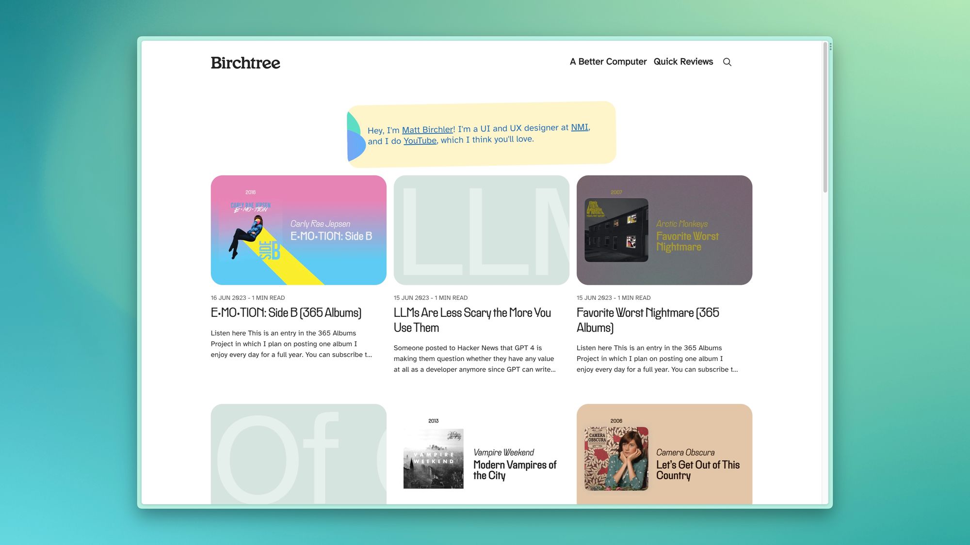
The previous design was based on the Attila theme, although you'd probably never know it. I started with that theme in 2019 when I migrated to Ghost, but I'd customized it so completely that I basically had created something completely custom.
I felt the design as of yesterday was pretty good and distinct, but it had some issues. The biggest (no pun intended) one was that everything was small. The text was readable, but I limited the width of posts to the point where images were quite small. This wasn't always an issue, but I really noticed it in posts like this where I was trying to show a UI detail, and I just had to hope that users would pinch to zoom in on the image to really see it in detail.
The New Design
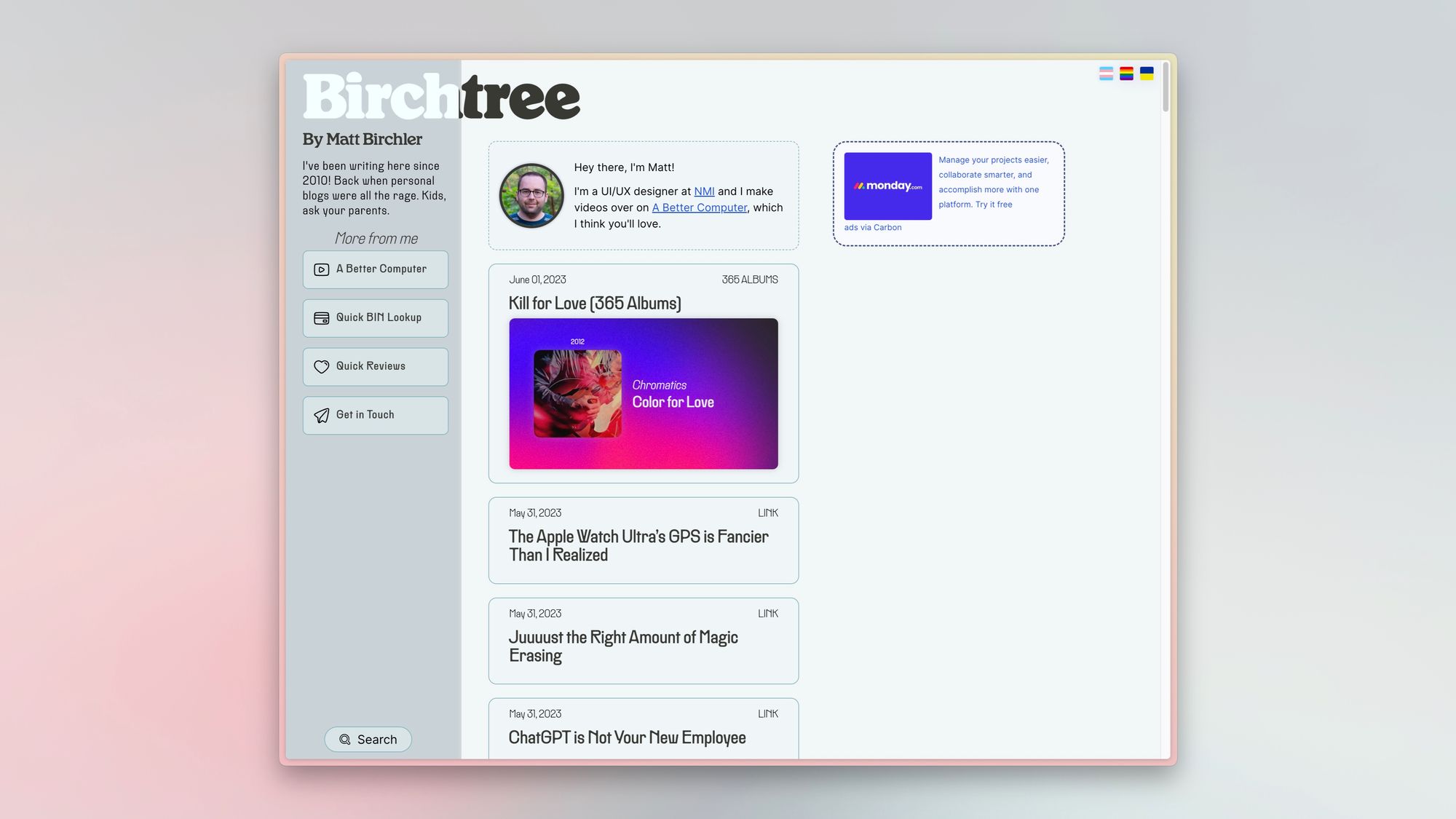
The new look for Birchtree definitely feels more in line with current trends, and it addresses the issue I had with images mentioned above quite well. I'm building on top of the Nova theme, which is quite excellent on its own, but of course I've gone in and tweaked it to better suit my needs.
First, all my fonts have come over, including the wonderfully legible Atkinson Hyperlegible. I also made some tweaks to remove some elements that were built around newsletters, which I currently do not do. The theme also assumed I would have a "featured" post I would want to have always pinned to the top of my home page. I don't, so it got the boot as well.
There was also a good amount of work to do tweaking the home page, namely around the header images. Long story short, the theme cropped all header images on the home page to a 4:3 aspect ratio, which doesn't work great for me, especially as I post a new album everyday with a 16:9 image that often looks bad when cropped down. 16:10 looked great, through.
The theme also assumes you don't have 3,000+ posts, because there was no functional pagination on the home page. Oh no! Thankfully, I was able to figure out how to reimplement the same style of pagination I wanted and now you should see 15 posts per page, which is much more reasonable.
Finally, I've made tons of tweaks to how individual posts are displayed, from text size to block quotes to a bunch of other little details. I'm sure I'll tweak things over the coming days, but I think it's in a good place right now.
Takeaway
As ever, my website changes always follow the same rule: I can change whatever I want as long as I don't make my readers change their behavior at all. There's no new feed or new URLs to learn, it's just a new look for a website that turns 13 (😱) in a few months.