A common bug in web apps (and how to fix it)

— 2 min read
I think Claude is an underrated contender in the chatbot wars we're currently living through, but they don't have an iOS app. That's not the end of the world as you can save it as a web app to your home screen and get a very good experience anyway.
Well, a really good experience besides one thing that really bothers me…
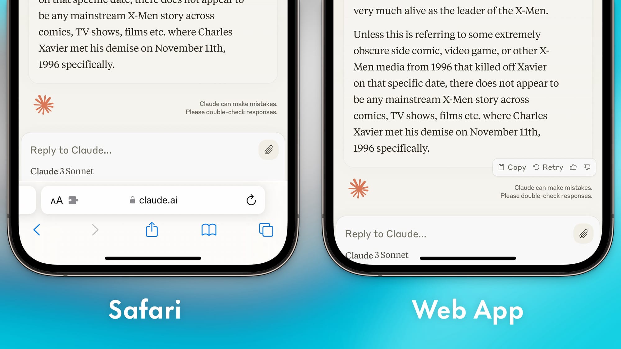
In the image at the top of this post you can see the bottom of Claude's mobile UI when in Safari (left) and when saved as a web app (right). The touch target might be a little small, but in Safari the text box at the bottom looks fine to me and has appropriate spacing. However, when viewing the same thing in the web app version, you can see we're far too cramped. The model name in the bottom left is cut off by the curve of the screen and the text field has basically zero margin to the home indicator. It just feels off and makes an otherwise great web app experience feel a bit jankier than it should.
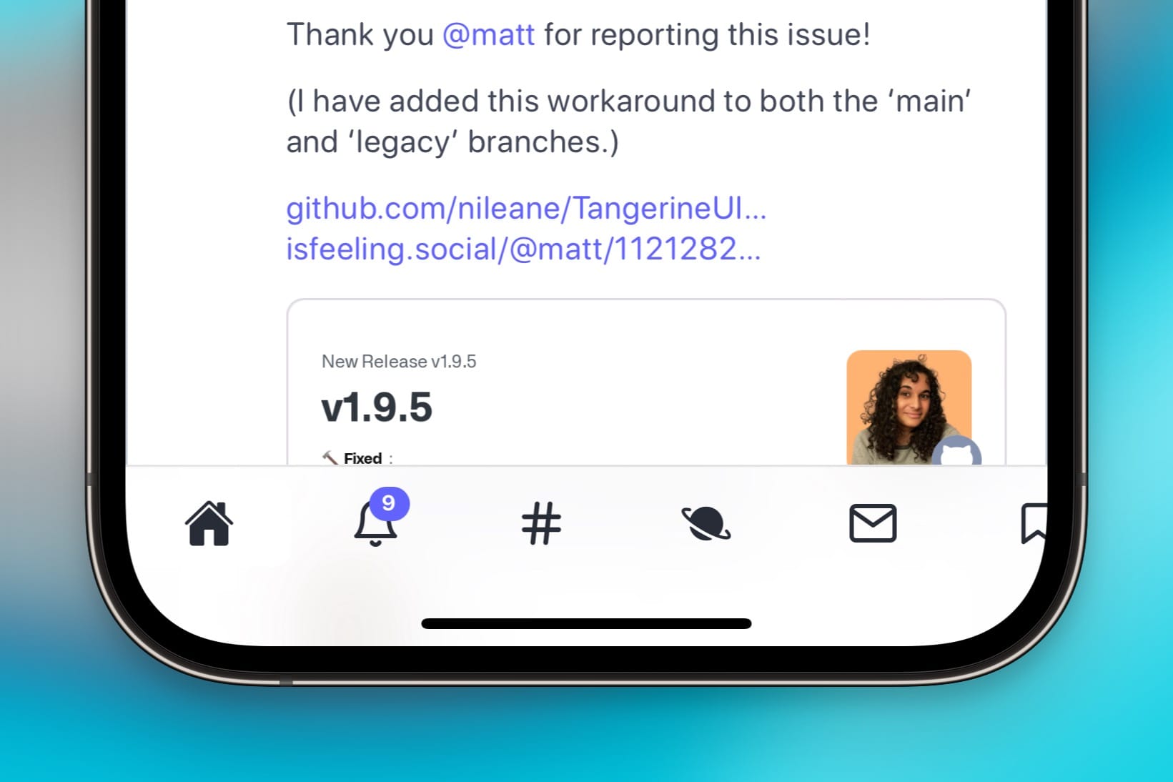
Here's another example, Mastodon using the otherwise excellent Tangerine UI (update a the bottom):
We've got the same issues here: the bottom navigation is good in Safari, but cramped and incorrect on the web app. Thankfully, as a Mastodon server admin I am able to inject custom CSS for my server, which let me fix this with a few lines of code.
How web developers implement this
CSS actually makes it easy for web developers to use different styling for both these situations using the display-mode media query. Here's an example of how you could change the display of something like the example above:
/* Styling when displayed within a standard browser*/
@media (display-mode: browser) {
  .nav {
    height: 50px;
    padding-bottom: 20px;
  }
}

/* Styling for web app mode */
@media (display-mode: standalone) {
  .nav {
    height: 85px;
    padding-bottom: 55px;
  }
}
It's not wildly complicated, and you can read more about the media query here if you want to learn more.
You should also be using safe area checks to make sure your UI avoids things like hole punches, notches, and the home indicator. This won't fix everything (the Mastodon CSS was already using this, for example), but it's the bare minimum you should make sure is there.
Update: the Tangerine UI project has already been updated with a fix for this display issue specifically when being used as a web app. You love to see it!